
Header layouts can be picked from a list of 8 options:
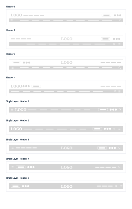
As of today, Page-Builder supports 2 types of headers:
A primary header that will stick throughout the website
A secondary header that appears topmost on the website
Header Style: Click on the layout icon to change the header style. 
Header settings: Customize the header with the following format.
- Logos that appear constant on the sticky scroll of the header
- Logos that are static on the header at the top of the page
- Primary Header background color - You can set the primary header color and text color
- Secondary Header background color - You can set the secondary header color and text color.
- Social icon styles:

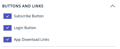
- Buttons and links:
To display buttons and links on the header or no. These include:
The Subscribe button
Login Buttons
Links for Android and IOS apps

Page-Builder Release Note - 12th February 2025
Enhancement: Support TikTok icon on the header, footer & hamburger
This enhancement supports the TikTok social icon in the header, footer, and hamburger menu.
Page-Builder Release Note - 05th February 2025
Enhancement: Social Share On Website Header
The Social Share enhancement adds Google News, Jio, and Reddit icons to the header, footer, and sidebar, following the order configured in Bold. On mobile, these icons appear within the hamburger menu. The enhancement also supports both RTL and LTR layouts, along with seamless compatibility for dark and light modes.
Page-Builder Release Note - 20th January 2025
Enhancement: Support a.m./p.m. localisation
This enhancement ensures that the time stamp in the header correctly shows custom AM/PM labels set in the page builder instance, especially for RTL languages. Custom labels will now be prioritized over default ones for the AM/PM.
Following the update: As part of the CLS fix, we now allow publishers to define the height and width of their logo image for both desktop and mobile platforms. This can be configured in the header settings, as shown in the screenshot below. By reserving the space for the image before it loads, this adjustment prevents layout shifts and significantly improves the site's CLS score on PageSpeed Insights.

Page-Builder Release Note - 23rd May 2024
Prior to the update: The width of the for the menu items in Header 5 and 6 was set at 75%.
Following the update: We have increased the width set from 75% to 85% which will help add more menu items for Header 5 & Header 6.
Page-Builder Release Note - 16th May 2024
Prior to the update: Initially in the mobile view for Header-5 and 6 the sub-menu items are not available like desktop view because of which many sections are missing for the user to access directly from the sub-menu.
Following the update: For Header-5 and 6 there is a horizontal scrollable sub-menu, this will allow users to scroll horizontally to view all the menu items.
Page-Builder Release Note - 23 Feb 2023
Enhancement: Dark Mode for Search Bar in Header 5 & 6
The 11 headers where except the header 5 & header 6 - the colour of search bar is taken from primary / secondary header colour (existing functionality, works). Header 5 & Header 6 search bars will have #1D1D1D in dark mode & #FFFFFF in light mode.
Page-Builder Release Note - 30 Sept 2022
New Features and Enhancements on Ahead/PB
1. New Header: Header 6
2. RTL Preview on Pagebuilder
3. Uniform Time Zone
4. SEO Metadata on static pages
5. AMP Auto Redirection
6. Shortcodes Targetted Serving of custom code on templates
1) New Header: Header 6
A new header is introduced to Ahead/PB named “Header 6”.
The new header adds the following:
- Bigger logo, center aligned.
- The logo is now allocated a maximum of 104px height on the Desktop and
64px on Mobile. For reference, other headers except “Header 5”
allocates a maximum of 56px on desktop and 32px on mobile.
- This helps to give more prominence to the logo and establish brand
identity.
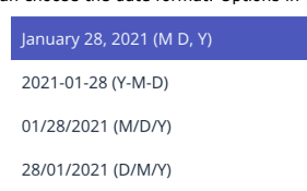
- Date and time.
- You can now choose to display the date and time on the header. This
works by picking the time from the user's device.
- You can choose to enable date alone
- You can choose to enable time alone
- You can choose to enable the date and time together
- You can choose the date format. Options in the image below
- Date and time can be configured from Header Settings > Date and
Time
- Mega menu on Header (Desktop Only)
- MegaMenu comes to use for publishers who do have a large number of
links to be displayed to the end user.
- The mega Menu is powered by the menu group with slug
“mega-menu” created on Bold CMS.
- The mega menu opens up on click on the 3 dots that come up on the
primary menu bar.


- The background color of the megamenu is set from Header Settings >
HAMBURGER AND MEGAMENU
- Header 6 provides the following functionalities as well.
- Enable or Disable App download links
- Enable or Disable Sign-in, Subscribe Buttons
- Enable or Disable Social Media Icons
- Enable or Disable Hamburger Logo, see the following image.